Years of
Experience
I am Abeeb Bamgboye

UI/UX Designer
I create digital experiences that are intuitive, visually appealing, and easy to use.
0+
0+
Projects
Completed
Completed
0+
Happy
Clients
Clients
0%
Client
Satisfaction
Satisfaction
My Design Services
I transform complex ideas into clear, engaging interfaces through thoughtful design processes.
SERVICES
UI/UX Design
As a UI/UX Designer, I specialize in creating digital experiences that are not only visually compelling but also intuitive and efficient. My approach combines strategy, empathy, and aesthetics to transform complex ideas into clear, engaging interfaces.
I believe that great design should be human-centered. Through thoughtful user research, structured wireframing, and polished visual design, I create products that feel seamless, meaningful, and intelligently designed. Every project begins with understanding the user's needs and ends with a solution that elevates their everyday interactions.
My design process is collaborative and iterative, ensuring that every interface I create is optimized for both user satisfaction and business goals. Whether it's a mobile app, web platform, or enterprise software, I focus on creating experiences that users love and clients are proud of.
Design Process
My design methodology follows a structured yet flexible approach that ensures quality results at every stage:
- User Research & Discovery
- Information Architecture & User Flows
- Wireframing & Low-Fidelity Prototypes
- Visual Design & High-Fidelity Mockups
- Interactive Prototyping & User Testing
- Design Handoff & Implementation Support
Featured Projects
A selection of my recent work showcasing my approach to solving complex design challenges.
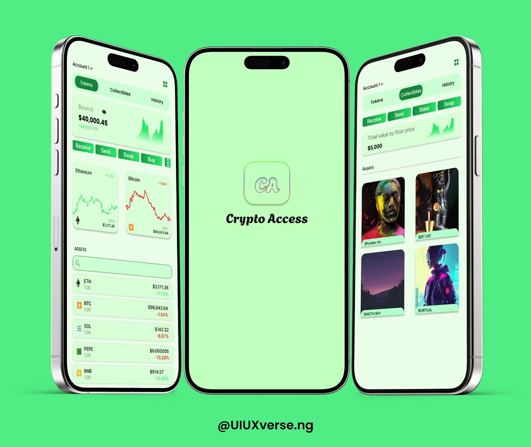
Crypto App
Modern crypto wallet and portfolio management app
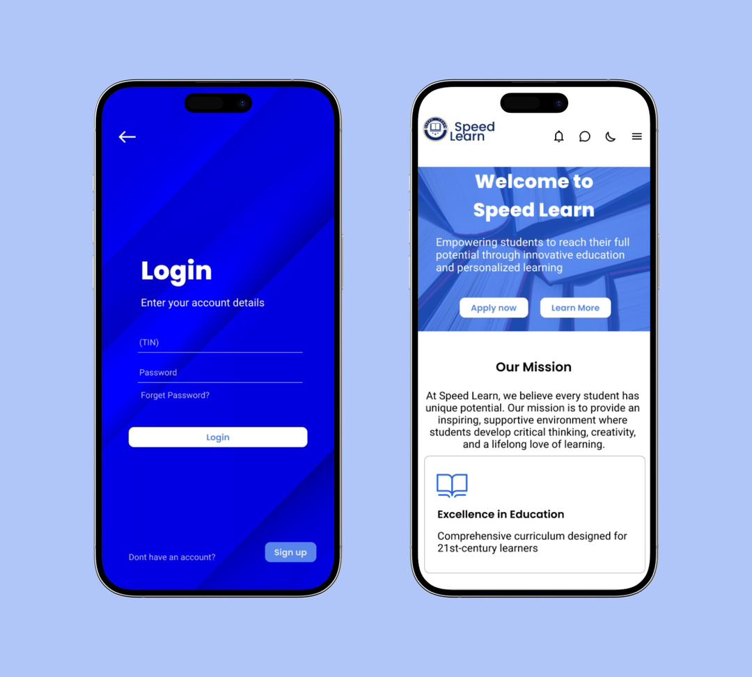
School App
School management and education mobile app
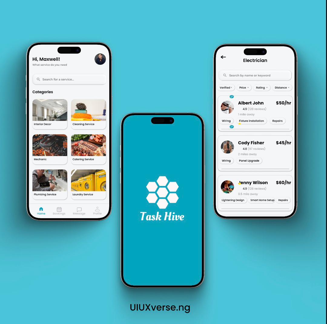
TaxHive
On-demand services app for technicians
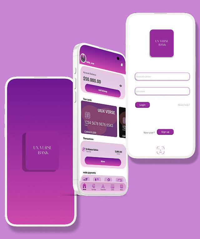
Bank App
Secure and intuitive mobile banking application
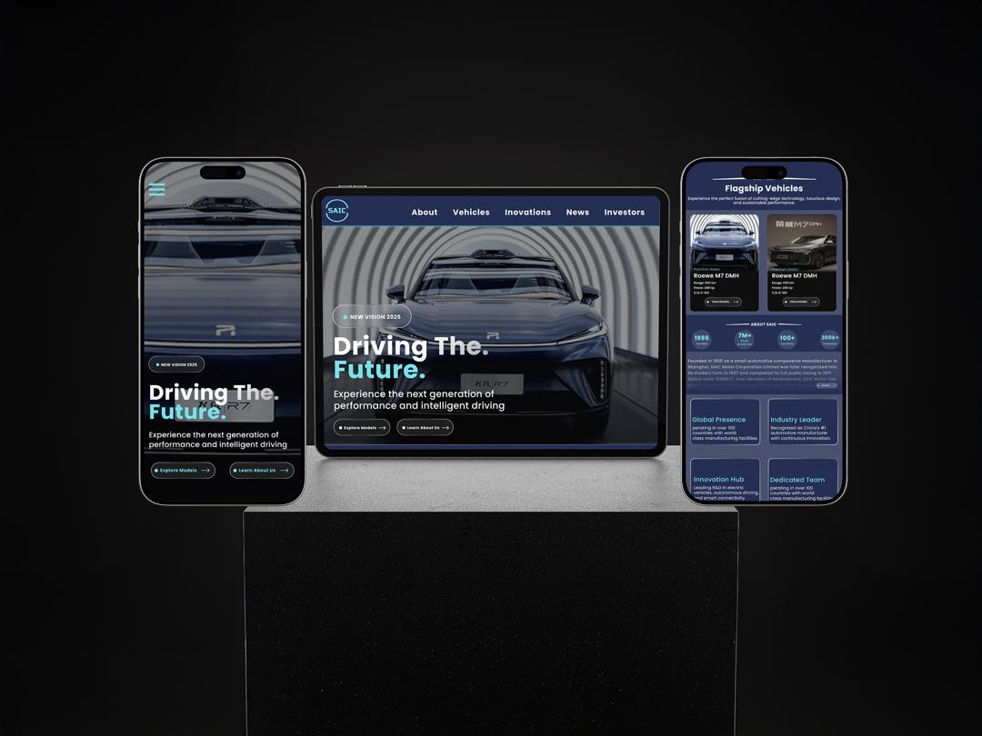
Automotive Corporate Platform
Mobile-first corporate website redesign
Crypto App
A modern crypto wallet and portfolio management app designed to simplify cryptocurrency use for both beginners and experts. Provides a clean, secure, and intuitive interface that reduces transaction complexity.
Category
Finance App
Tool
Figma
Role
UI/UX Designer
Type
Mobile Application
Project Overview
This project addresses the complexity and intimidation factor of most cryptocurrency apps. Many existing solutions are confusing, cluttered, or too technical for new users, leading to frustration and potential financial mistakes.
The challenge was to design a crypto app that stays truly simple and secure while handling complex blockchain features. The goal was to minimize user mistakes and confusion without cutting essential functionality.
The Problem
Most crypto apps are confusing, cluttered, or too technical for new users. Complex terms, unclear security flows, and poor navigation often lead to frustration or mistakes in financial transactions. Users need a platform that makes cryptocurrency accessible without compromising on security or essential features.
Design Goals
• Make onboarding and wallet setup beginner-friendly
• Present crypto data (portfolio, charts, balances) cleanly and readably
• Reduce complexity with simple terms and clean layouts
• Ensure users feel safe through clear security screens
• Build a consistent, modern visual identity
Final Outcome
The result is a clean, intuitive crypto app that feels modern and trustworthy. It presents complex blockchain features in a simple way, combined with a smooth user experience and visually appealing UI. The project demonstrates my ability to handle end-to-end product design, simplify complex systems, build structured user flows, and create polished, consistent interfaces.
School App
A school management and education-oriented mobile app designed to help students, parents, and teachers manage academic tasks, courses, assignments, grades, schedules, and communications.
Category
Education App
Tool
Figma
Role
UI/UX Designer
Users
Students, Parents, Teachers
Project Overview
Many educational apps are cluttered, poorly organized, or confusing, especially when they bundle too many features. Users often struggle to find what they need quickly or understand how to navigate the app effectively.
The challenge was designing a school app that organizes essential features clearly, ensures easy navigation, and fosters a smooth user experience across different user roles (student, teacher, parent).
The Challenge
Designing a multi-role application that serves different user needs while maintaining simplicity. The app needed to handle courses, assignments, schedules, grades, notifications, and communication without overwhelming any user group.
Design Goals
• Create clear navigation structure for all features
• Present academic data in clean, organized layouts
• Support different user roles with simple onboarding
• Maintain consistent visual style across many features
• Ensure responsive, mobile-first experience
Final Outcome
A well-structured, user-friendly school app interface that makes it easy for different users to navigate academic data and tasks. This project demonstrates my ability to plan and design complex multi-feature apps with multiple user roles, strong information architecture skills, clean modern UI design sensibility, and proficiency in prototyping interactive flows.
TaxHive
A mobile app for finding and booking technicians and specialists easily. Led the UX research, UI design, and interactive Figma prototype to create a clean, trust-focused experience.
Category
On-Demand Services
Tool
Figma
Role
Lead UI/UX Designer
Services
Technicians & Specialists
Project Overview
TaxHive helps users quickly find and connect with technicians across various fields (electricians, plumbers, IT support, etc.). The goal was to create a simple, efficient experience where users can request services, communicate with professionals, and track service delivery all in one place.
Finding reliable technicians can be difficult and time-consuming, especially when service quality and trust are top priorities. The challenge was designing an intuitive, trustworthy on-demand service app.
My Role
• UX Research
• Information Architecture
• UI Design
• Interaction Design
• Figma Prototyping
Key Screens
• Onboarding / Welcome
• Home / Search & Categories
• Technician Listing
• Technician Profile & Ratings
• Booking Request Flow
• Messaging / Contact
• Notifications
• User Profile & Settings
Impact & Learning
TaxHive simplifies service requests by offering one place to find specialists, boosts trust with clear profiles and reviews, improves user confidence with clean UI and easy booking flow, and saves time by reducing effort to find help.
What I learned: How to design for on-demand services with real user needs in mind, improving clarity and trust through layout and content hierarchy, and building interactive prototypes that showcase realistic flows.
Bank App
A mobile banking app designed to offer users a secure, intuitive, and seamless banking experience. Creates a clean, trustworthy interface that simplifies financial tasks while prioritizing security and ease of use.
Category
Banking & Finance
Tool
Figma
Role
UI/UX Designer
Focus
Security & Simplicity
Project Overview
Many banking apps suffer from complex navigation, confusing layouts, and security-overload that intimidates everyday users. Users struggle to find essential functions or feel unsure about safety when performing financial transactions.
The challenge was to design a banking app that balances comprehensive functionality with simplicity, ensuring strong security perception while maintaining ease of use.
Design Goals
• Provide clear dashboard overview (balances, activity, quick actions)
• Enable easy navigation to key functions (transfers, deposits, history)
• Ensure strong perception of security and trust
• Design clean UI with clear hierarchy, avoiding clutter
• Offer smooth, intuitive flows for critical financial tasks
• Use consistent visual language and understandable icons
Key Features
• Clean dashboard with financial overview
• Easy fund transfer interface
• Transaction history with filters
• Account management settings
• Security features and authentication
• Notifications and alerts system
Final Outcome
A polished, user-friendly banking app UI that balances functionality with simplicity. This project demonstrates my ability to design secure, trustworthy interfaces appropriate for financial products, build complete user flows from onboarding to transactions, apply strong information architecture skills, maintain UI consistency, and turn complex banking processes into clean, intuitive experiences.
Automotive Corporate Platform
A conceptual redesign of a global automotive corporate website focused on improving usability, clarity, and visual hierarchy. Transforms complex, information-heavy corporate platforms into modern, user-friendly experiences.
Category
Web Platform
Tool
Figma
Role
UI/UX Designer
Approach
Mobile-First Design
Project Overview
This project reimagines a global automotive corporate website, focusing on improving usability, clarity, and visual hierarchy. The goal was to transform a complex, information-heavy corporate platform into a modern, user-friendly experience that clearly communicates brand value, innovation, and key information to a broad audience.
The design prioritizes accessibility, intuitive navigation, and a polished visual language suitable for a large automotive organization with global reach.
The Problem
Many corporate automotive websites prioritize information volume over usability, resulting in cluttered layouts, weak visual hierarchy, and poor navigation. Users often struggle to quickly understand the brand, find relevant information, or engage meaningfully with the platform.
Design Goals
• Improve clarity and visual hierarchy across all screens
• Simplify navigation and information architecture
• Present corporate information in structured, scannable ways
• Create a modern, premium automotive aesthetic
• Ensure mobile-first usability and responsiveness
• Deliver smooth, intuitive user experiences
My Role & Process
Role: UI/UX Designer
Process:
• UX Research & Content Structuring
• Information Architecture
• User Flow Mapping
• Wireframing (Low-Fidelity)
• High-Fidelity UI Design
• Figma Prototyping
• Refinement & Presentation
Key Screens
• Mobile Homepage / Landing
• Navigation & Menu System
• Corporate Overview Section
• Innovation & Technology Highlights
• News & Updates
• Sustainability / Corporate Responsibility
• Footer & Supporting Information
Challenges & Solutions
Challenge: Managing large volumes of corporate information
Solution: Structured content using sections, cards, and clear hierarchy
Challenge: Poor navigation clarity in corporate platforms
Solution: Simplified navigation with clear labels and logical grouping
Challenge: Balancing professionalism with engagement
Solution: Clean layouts, modern typography, and subtle visual emphasis
Impact & Learning
Impact:
• Improves clarity and usability for broad audiences
• Makes corporate information easier to find and understand
• Enhances brand perception through modern UI
• Delivers mobile-friendly, accessible experience
What I Learned:
• Designing for large-scale platforms requires strong information architecture
• Visual hierarchy is critical with dense content
• Mobile-first thinking improves clarity
• Research-driven decisions lead to intuitive experiences
About Me
Hello, I'm Abeeb Bamgboye Adunfe, a UI/UX Designer committed to shaping purposeful and human-centered digital experiences. I approach design as a balance of strategy, empathy, and aesthetics—transforming complex ideas into clear, engaging interfaces.
Through thoughtful user research, structured wireframing, and polished visual design, I create products that are not only visually compelling but also intuitive and efficient. My work is driven by a desire to elevate everyday interactions and craft digital solutions that feel seamless, meaningful, and intelligently designed.
I believe that great design should be invisible—it should work so well that users don't have to think about it. Every project I undertake is an opportunity to solve real problems, improve lives, and create experiences that people love to use.
My Design Skills
Proficient in industry-standard tools and methodologies to deliver exceptional digital experiences.
95%
Figma
90%
Adobe XD
85%
Sketch

88%
Illustrator

82%
Photoshop
Let's work together!
I design beautiful, intuitive digital experiences and I love what I do. Ready to create something amazing?
-
-
LinkedIn
Abeeb Bamgboye -
TikTok
@uiuxverse.ng -
Resume
Download CV